












































































How to Customize a Phone Case That Looks Premium: Colors, Textures, and Finishes That Work
A well-chosen phone case should make a daily essential feel more personal, more useful, and more enjoyable to carry. This guide explores practical choices that help shoppers make a confident decision while leaving room for individual style.
Premium design is about editing, not excess
When you customize a phone case, it is tempting to use every available color, icon, quote, and photo. Yet a premium-looking result usually comes from restraint. The design should have one clear focal point, an intentional palette, and enough empty space for the eye to rest. This is true whether you prefer a quiet monochrome case or a vivid graphic statement.
Think of the phone case as a small object seen at close range. Details matter more than they would on a large poster. A slightly awkward crop, competing typefaces, or too many accent colors can make an otherwise good idea feel busy.

Build a color palette with a purpose
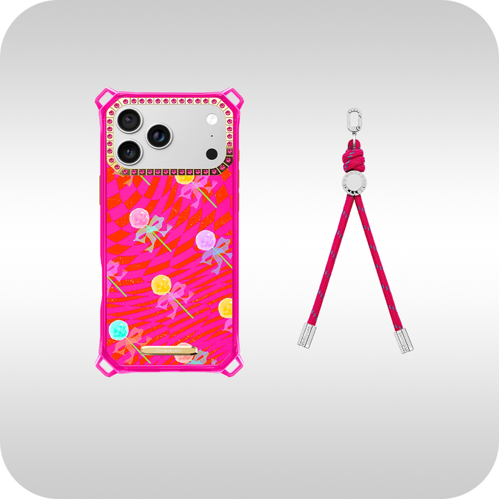
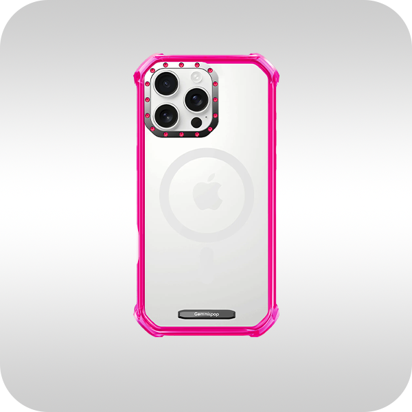
Start with a base color that reflects the mood you want: deep green or navy for a composed feel, warm neutrals for softness, bright pink or cobalt for energy, or translucent tones for a lighter look. Add one supporting color and one accent only if the accent has a job to do. It might draw attention to an initial, define a border, or connect a photo to the rest of the layout.
For everyday versatility, borrow colors from your wardrobe, jewelry, bag, or laptop accessories. A case does not need to match every outfit, but it should look like it belongs in your visual world.

Use texture to make the design feel tactile
Texture can make a flat design feel more dimensional. Mosaic-like arrangements, crystal-inspired details, subtle gradients, or repeated geometric shapes can add visual depth without requiring a large number of elements. The key is consistency. If the surface has a detailed pattern, keep text simple. If the design uses a bold phrase, give it a quieter background.
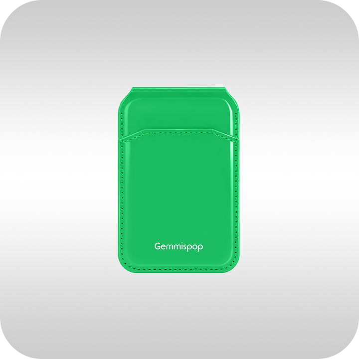
Texture should also support grip and everyday comfort where possible. Consider the effect of a smooth gloss, a softer matte finish, or a raised decorative element before you commit to the look.

Choose a finish that supports the concept
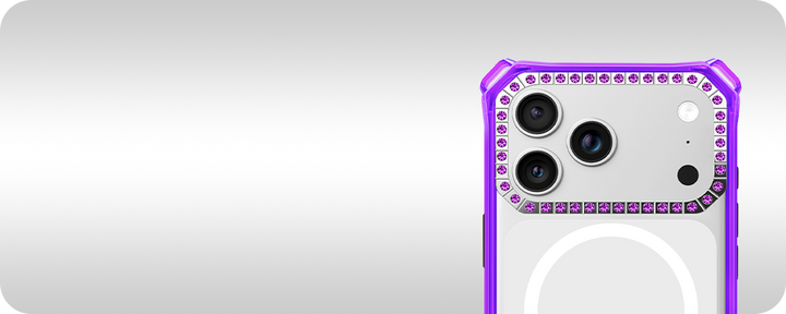
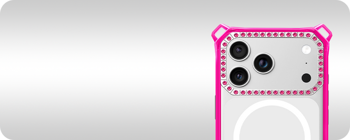
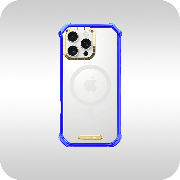
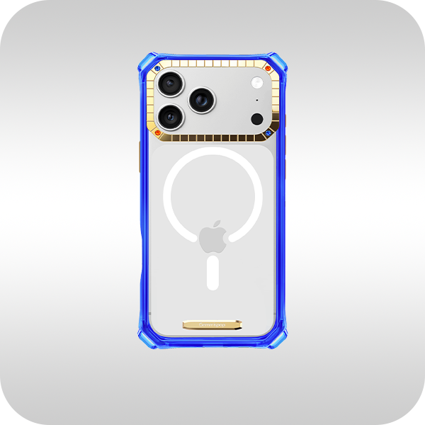
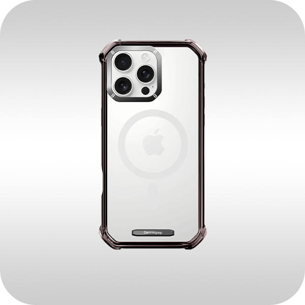
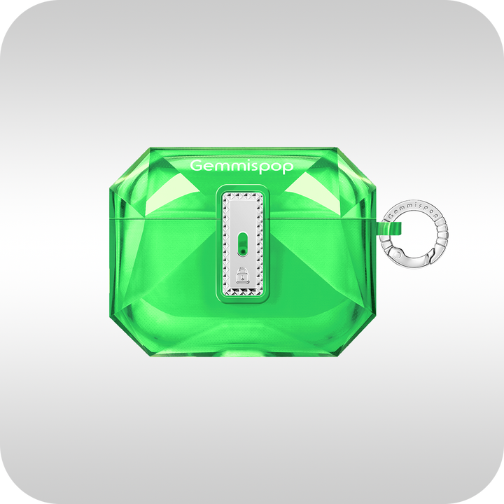
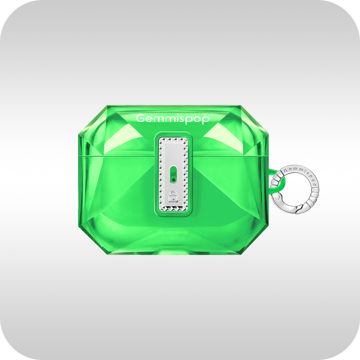
Gloss can make saturated colors and photographs appear more vivid. Matte can make neutrals and graphic patterns feel refined. Clear sections can work well when you want the phone color to become part of the design. A crystal-inspired finish can add a more decorative, premium character, particularly when the rest of the composition is controlled.
Before finalizing, look at the case from arm’s length as well as close up. The design should read clearly in both situations. If the main visual disappears from a distance, strengthen the contrast or simplify the surrounding details.

Gemmispop style recommendation
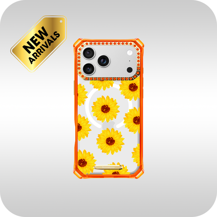
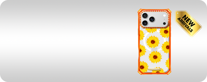
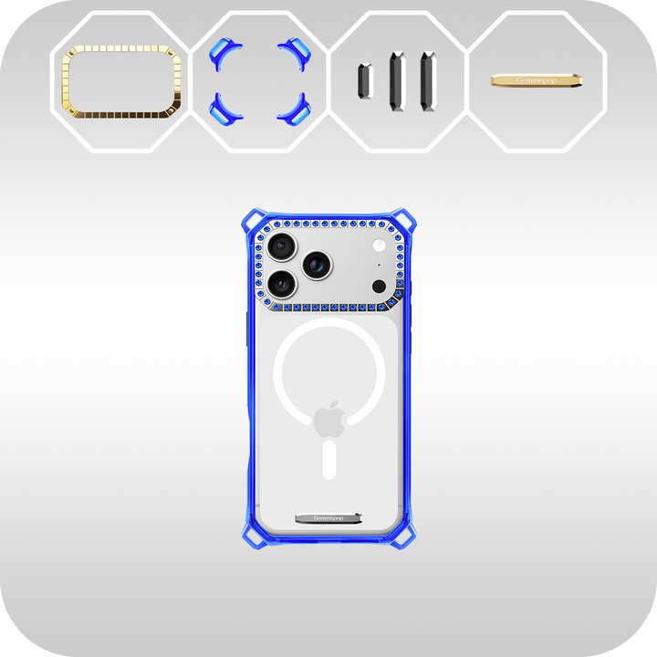
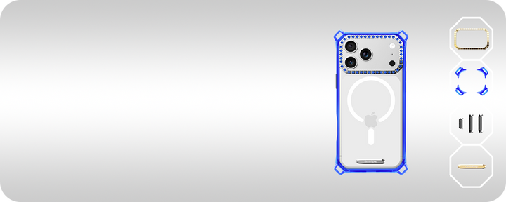
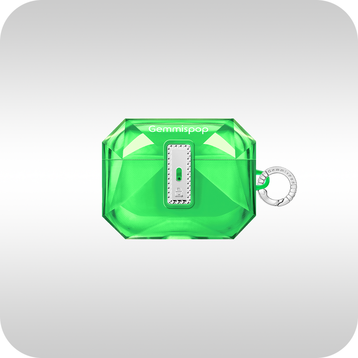
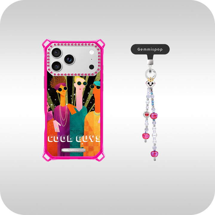
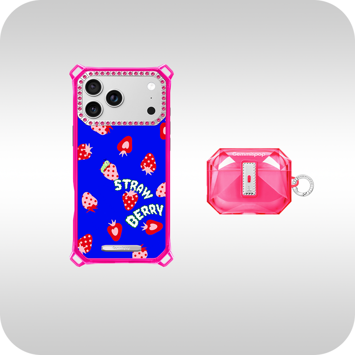
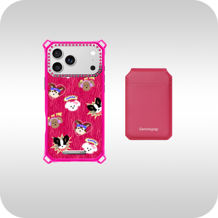
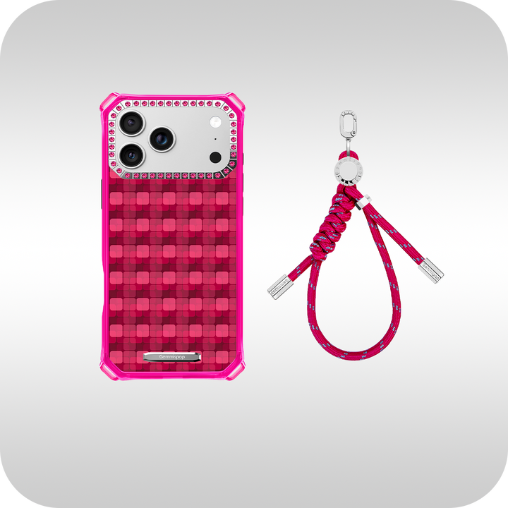
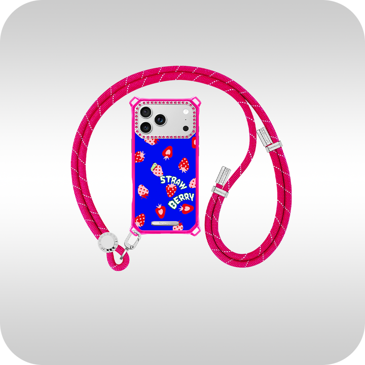
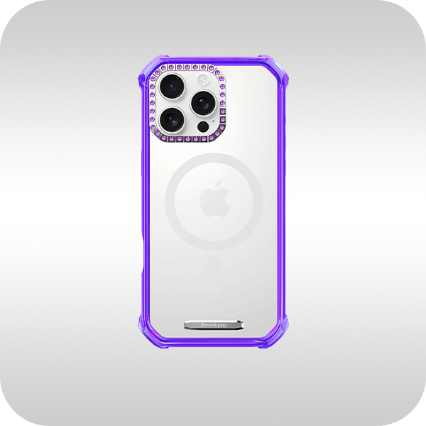
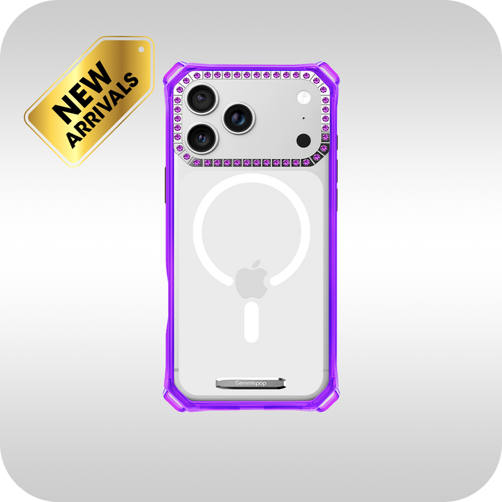
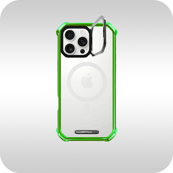
M.C Mosaic × Pattern from Gemmispop is a useful reference for how a repeated visual motif can create a rich, polished surface. The design demonstrates that a detailed case can still feel cohesive when the pattern, color treatment, and finish all support the same idea.
FAQ
What colors make a phone case look expensive?
There is no single answer, but deep jewel tones, soft neutrals, intentional contrast, and balanced accent colors often create a more polished result than random combinations.
Is a matte or glossy phone case better?
Choose gloss for vivid color and shine, or matte for a softer, more understated look. The best choice depends on the design and how you use your phone.
How do I avoid a cluttered custom case?
Give the design one hero element, limit the palette, and remove any detail that does not support the main idea.

Recommended Gemmispop Product
M.C Mosaic × Pattern: https://gemmispop.com/products/best-trendy-synthetic-crystals-iphone-15-pro-max-case-mc61


